The trippy music posters that defined the counterculture

The psychedelic graphics of the late 1960s evoked the anarchic, iconoclastic energy of the era. Joobin Bekhrad explores a kaleidoscopic world.
With their kaleidoscopes of colour, undulating typography, and all manner of mythical beings, the rock ’n’ roll posters of the late 1960s were often even more psychedelic than the music they represented. In Britain and the US, independent artists and creative collectives aimed not only to spread the word about the musical acts of the day, but also to encapsulate their musical vision and energy via fly-posters.
More like this:
At the forefront of the rock ’n’ roll poster scene in London towards the end of the decade were Nigel Waymouth and Michael English, who together formed design duo Hapshash and the Coloured Coat. Although the pair only worked together for 18 months, between 1967 and 1969, they nonetheless created some of the most iconic and defining images of their genre, and were instrumental in pushing the boundaries of the rock ’n’ roll poster as a communication medium. In the early 2000s, the V&A Museum staged a retrospective of the duo’s work, and now the Bamalama Gallery in London is celebrating their work in the exhibition Bamalama Takes a Trip. “We’re looking to appeal to a new audience [that] may never have seen Hapshash’s work, and who may not have seen the 2000 show, [either],” says curator John Brett.
 Bamalama Gallery
While Waymouth worked as an artist with English, his involvement with rock ’n’ roll transcended graphic design. In 1966, a year before partnering with English, Waymouth, along with then-girlfriend Sheila Cohen and John Pearse, opened the fashion boutique Granny Takes a Trip on the King’s Road. One of Swinging London’s prime sartorial destinations (if not the destination), Granny’s regulars included the likes of the Rolling Stones and the Beatles, who could often be spotted wearing the store’s hip offerings. In that sense, Granny laid the foundations of Hapshash, which went on to create posters for the boutique, too.
It was thanks to the founders of London’s UFO club that Waymouth and English, both former art school students, met. Initially, the duo dubbed itself Cosmic Colours, but later changed its name as it was looking for something more novel. “It was an accident,” Waymouth tells BBC Designed. “It was originally supposed to be ‘Hatsheput’, based around the idea of Queen Hatsheput, one of the most powerful women in Egypt who ruled as king… We thought, ‘What a funny idea’, and then got inspired by the biblical story of Joseph and his coloured coat. We wanted a name that people would pay attention to.”
Arresting in their intricacy and sheer beauty, Hapshash’s posters – multiple copies of which were often pasted at a time – not only attracted the interest of ersby, but also demanded attention. “Our designs had a startling effect on the fly-posters of London,” recalls Waymouth. “I’ve often described a block of 20 to 30 posters of a single one of our designs as a ‘powerful visual shock’”. Fly-posting was, of course, illegal, but Hapshash managed to routinely evade the authorities by virtue of their visual appeal. “We got away with the posters as they were so pretty to look at,” says Waymouth.
So pretty were they, in fact, that many took to collecting them. “They were eye candy to match any psychedelic experience,” says Waymouth, “and it was gratifying as an artist when people started tearing them down to decorate their own walls at home”. That said, it wasn’t only in prohibited public spaces that Hapshash’s posters could be seen; they were also displayed in “outlets that were sympathetic to the underground, counterculture movement”, according to Waymouth, such as particular record, clothing, and book stores, as well as various music venues for which the duo designed posters.
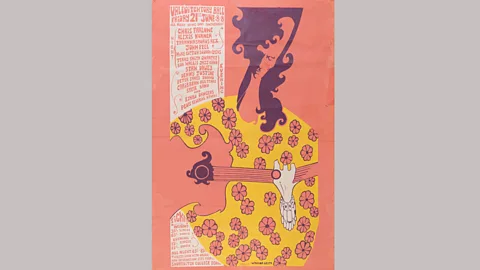
From a marketing perspective, Waymouth and English’s approach to poster design may seem illogical. Their ments – Hapshash was not in the business of creating art for art’s sake – were often difficult to read, especially from afar, and required viewers to invest time making sense of their explosions of words and images. The word ‘UFO’, for instance, on a poster designed for the eponymous London nightclub, can easily be mistaken for a meaningless cluster of squiggles, or the date 1986. On another poster (designed for the same club), the names of the acts scheduled to play and the dates of their performances look as if they are part of the extraterrestrial illustration.
 Hapshash/ Bamalama Gallery
Yet, so compelling were Waymouth and English’s images that they were able to enjoy the best of both worlds and pull things off both artistically and commercially. “We [also] got away with the posters as… the contents, including the words, required closer attention than people could give at first glance,” Waymouth says. The beauty and complexity of their posters further worked to Hapshash’s advantage – they resulted in the authorities completely overlooking the sexually-charged imagery of some of the posters. “We were never busted, not like some,” re Waymouth. “I do put it down to the fact that [the posters] were so detailed, yet pretty to look at.”
Although the headiness of Hapshash’s designs has prompted some to draw connections between them and psychoactive drugs like LSD – which many artists in Swinging London were experimenting with and drawing inspiration from at the time – Waymouth insists that drugs in general played a relatively minor role in his work with English. “Drugs were part of the counterculture in general – it was almost as if they were a weapon against authority,” he says. “There was t-smoking, but nothing heavier than that. When we were creating the posters, however, we weren’t stoned. We were too busy concentrating on our work.”
 Bamalama Gallery
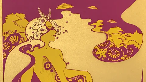
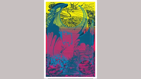
So where did Hapshash’s influence come from? Aside from the music of groups like Pink Floyd and the Jimi Hendrix Experience that they were aiming to reflect, Waymouth and English also looked to particular visual artists and artistic movements. A woman in a promotional poster for the Soft Machine, for instance, brings to mind Aubrey Beardsley’s depiction of Salomé as she appears in the illustrations for the Oscar Wilde’s play of the same name. “We had the work of … Beardsley in our minds,” says Waymouth. Some of their other female figures are similar to those in the work of Art Nouveau artist Alphonse Mucha, and elsewhere, there are smatterings of the Tolkienesque (winged dragons and elves), and even Disney characters. “Pop art was obviously prevalent,” recalls Waymouth. “We found our inspiration from a lot of places, but mainly from [artistic] styles from the 1890s to the 1960s. There were [also] a lot of 1920s Art Deco influences around the scene, generally… and I we discussed the ephemeral nature of Marcel Duchamp’s Dadaist artworks in great length.”
Cosmic visions
Waymouth and English weren’t only influenced by the visual, however. The East provided more to Hapshash than just its name. Just as the duo’s friend Pete Townshend became intrigued by the teachings of the Parsi mystic Meher Baba, the artists were curious about Eastern spirituality. A poster entitled Save the Earth shows the influence of Buddhist iconography. “It wasn’t so much a fascination as a wanting to embrace and understand something new,” explains Waymouth. “We were deg in a period of time when people were starting to look for alternative spiritual guidance, to make a definitive break from British conservatism and the Church of England. People were inquisitive, and we were finding things out for the first time – [and] we reflected that need of wanting to understand… in our designs.”
 Hapshash/ Bamalama Gallery
Unlike musicians of the era like George Harrison and Richard Thompson, though, who converted to Hinduism and Sufi Islam respectively, Waymouth and English didn’t become followers of any particular faith or school of thought. “We thought of ourselves as being more iconoclastic than following traditions. The whole idea of the counterculture was to continually bring in new ideas.” And it was Waymouth who was largely responsible for putting new ideas to use in Hapshash’s work. “Michael had been to art school and brought technical skills as well as attention to detail, whilst I brought an imagination for romantic ideas and the ability to do figurative drawing.”